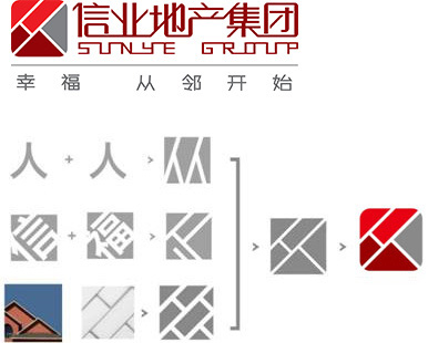


Logo Design Description:
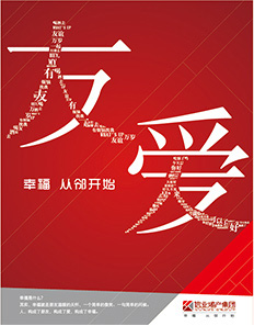
The logo is composed of three color blocks: positive red, dark red and silver gray. The splicing between the color blocks shows two colors
The word "people" symbolizes the core concept of "Xinye real estate group" - people-oriented, always paying attention to the harmonious relationship between people;
The color block composition of the logo is taken from the modeling image of the external wall and eaves of the building, representing the belief of "Xinye real estate group" deeply rooted in the real estate industry and the steady and down-to-earth development concept; In addition, capture the text structure of "Fu" and "Xin" to convey the brand vision of "Xinye real estate group" to build mutual trust, happiness, harmony and communication between people with high-quality products;
The founder and stable composition reflects the firm, steady and reliable characteristics of "Xinye real estate group";
"Red" represents trust, happiness and enthusiasm, highlighting the interactive relationship between people in two tones; "Silver gray" represents quality; It implies the pursuit of "creating a happy residence" by "Xinye real estate group".